Professional vs Amateur UI Design
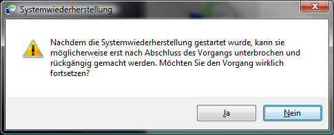
 The other day I started a System Recovery1 on my Vista. Surprisingly (or actually not so surprisingly), I’ve been prompted with the following initial message (translation from German, underlining mine):
Once system recovery starts, maybe it can only be interrupted and undone after it’s been finished. Do you really want to continue with the procedure?(Yes|No)
Click here to see a screen shot of the original message (in German)»
That’s a hell of an interruption after something has finished, right? But I might be able to interrupt it sooner. Maybe. Or maybe not. Whatever.
I’m not sure if this is an unlucky translation, or a dumb choice of wording in the first place. But whoever is responsible for messages like this, he is definitely overpayed for the job.
Crappy messages like this are so common, I hardly ever stop and wonder anymore. I did with this one though, and got inspired to post about it.
But this post would be nothing but a rant, unless I proposed a rephrase for the better. Let me think… How about this:
Dear user,
please note that system recovery is a time and resource intensive procedure that cannot be interrupted, once started. It can, however, be undone after it’s been finished.
If you are prepared to start the procedure and refrain from using your computer for several minutes, press Continue.
If not, press Abort.
(Continue|Abort)
Besides rephrasing the message text to be both, more friendly, and more precise, I also gave it some more space to “breathe”, so it’s visually easier to encompass. I’d also add some images and colors to make the core message stand out.
Of course the latter variant needs both, more thought, and more work. But user interface design is not something you do “along the way”, while, for example, coding. It just won’t work. I happen to know a lot about UI design and usability, but it is of little use when I’m in coding mode. I need to switch to UI design mode in order to put that knowledge into good practice.
The point is, when you do UI design “along the way”, you do it like an amateur, like if it was a hobby. You spend “spare time” on it, while coding (or doing whatever else) professionally in your “main time”. It’s not your fault when this doesn’t work out. It’s how our psyche ticks.
Apple shows what works: They are known to spend significant time and money into designing their UI, and they let UI specialists design it. Microsoft (presumably) leaves it up to the programmers23, and everybody with Windows background who touched a Mac (or an iPhone) can tell the overwhelming difference.
- In case you don’t know, since Windows XP the operating system creates recovery points before every installation. If something goes wrong during the installation or an application, so you can’t uninstall it the usual way (or you are unsure if uninstallation really removed everything), you can roll-back relevant OS state (ex. registry) to a saved recovery point. It’s a sort of undo at system level. [↩]
- or MS used to do so during most of his history, and has to live with that legacy [↩]
- To be fair, things are even worse on Linux desktop UI’s. Some messages are way to technical for even a user with moderate technical knowledge to understand. [↩]


